Black Magic,
Now you see it now you don’t.
Kieran Woodhouse
P4085770
Module Name: Fine Art Dissertation, Artefact/Reflective Case Study.
BA (Hons) Fine Art. Level 6.
Module Code: FAE3013-N-BFI-2016
Module Leader: Aikaterini Gegisian
Module Tutors: Jared Pappas-Kelly
Deadline: 18th January 2017
Word count: 6,863 words [Including quotes, headings and image labels. Excluding Contents page, bibliography, Table of illustrations and Appendixes]
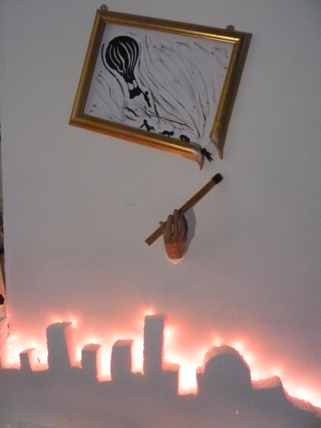
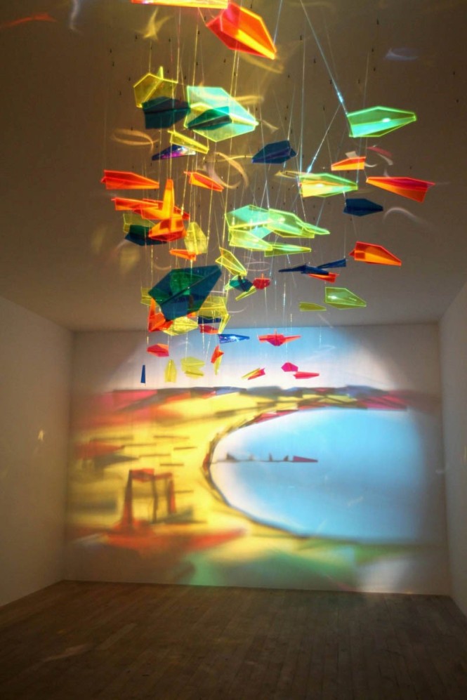
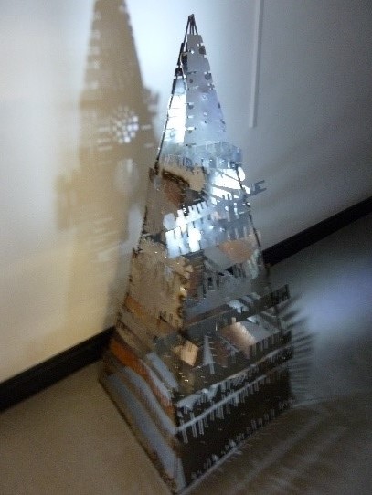
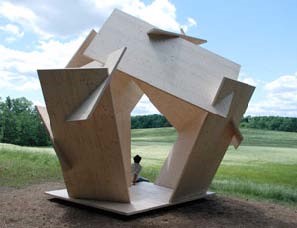
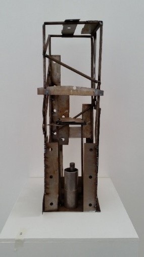
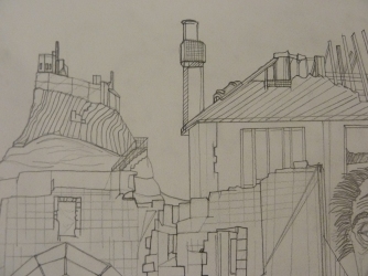
| My Cityscape Artwork |
Objects, either diverse or homogenous, are arranged in such a manner that shadows cast on a wall, under proper lighting, have little to do with the image of the initial installation. From this duality lies the magic of his works. [1]
Rashad Alakbarov
Contents Page
Introduction Page 4
Chapter 1: Pages 5 & 6
Chapter 2: Pages 7 & 8
Chapter 3: Page 8
Chapter 4: Pages 9 & 10
Chapter 5: Pages 10, 11, 12 & 13
Chapter 6: Pages 13, 14 & 15
Chapter 7: Pages 15, 16, 17, 18 & 19
Chapter 8: Page 20
Conclusion Page 20, 21 & 22
Bibliography Pages 23, 24, 25, 26 & 27
Table of illustrations Pages 28, 29 & 30
Appendix A Page 31
Appendix B Page 32, 33, 34 & 35
Black Magic, now you see me now you don’t.
Introduction
From the dawn of time shadows have been produced by the sun the moon and then by the fire that early mankind used to ward of danger, light their caves and generate warmth. Animals have evolved to adapt to different levels of darkness, because the world is full of shadows. One hides in the shadows as not to be seen. The information that is conveyed in a shadow is fundamental to the aid of seeing, as it gives extra information to our brains, to fill in the dots as it were when trying to decipher what we may be looking at. The underbelly of animals have evolved to be lighter than their backs for the reason that most natural light comes from above, and the paler belly counteracts the inevitable shadow, so the animal scarcely stands out and so is harder to see by the predator. Evolution has identified that the eyes of the predator would be primarily hunting from the shadows so has designed them to see shadows and contrasts when darkness falls. The fact that shadows are needed by most living thing to make sense of the world, to see depth, form, dark, light, wet and dry which are especially important within the visual arts intrigues me, and compels me to use them in my artworks.
My artwork this year is a progression from the pieces I was producing last year, which related to the theme of architecture and shadows. I felt I wished to widen the subject matter and push the shadow theme more into the forefront of my artworks, as the intransient appeal of shadows interested me. The fact that shadows are not permanent, only fleeting and controlled by time, and are only present as long as a light source is available, for example the trajectory of the sun as it passes from east to west each day. I wished to try and control them and so produce interesting and unusual pieces, by taming the medium of shade and light in an artificial way. Roberto Casati says; ‘Our vision is so bewitched by chiaroscuro that if we were to find ourselves suddenly in a shadow less world, everything would seem insubstantial and without depth’. [2] What he means by this is that our eyes are programmed to see the contrasts between light and shade within artworks, and the world around us, and life without shade would make everything appear flat, not three Dimensional.
Chapter 1: How artists have used shadows through the ages
Artists have used shadows through the ages in paintings, animation, shadow theatre, and sculptures, to name a few. The word shadow as used by artists is divided into three degrees, – Shadow, Half Shadow and Cast Shadow. Shadow, is the darkness that the object’s body creates upon itself, at the far end of the spectrum of shading. Half Shadow, is the area between light and shadow that gradually passes from one to the other, diminishing little by little according to the shape of the object. The Cast shadow is the shadow that is created on the ground by the portrayed object within the painting.
|
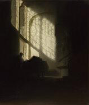
‘A man seated at a Table in a Lofty Room’ 1606 – 1669 |
While the Shadow and the Half Shadow must be present within a composition to create depth and give three dimensional structure to the artwork, the Cast Shadow has been in and out of fashion with artists throughout the ages. Yet it is the Cast Shadow that brings atmosphere and creates a mood to the composition that cannot be achieved without its use. In Leonardo Da Vinci’s time artists largely avoided using the Cast Shadow as they felt it spoilt their works and distracted from the composition they were trying to create. Da Vinci himself wrote on the subject and from his notes it could not be clearer his feelings on the subject. He thought it was easier to veil the sun, and create a slightly misty feel within the composition rather than to try and paint harsh cast shadows in a composition which portrayed an illuminated sunny scene.
A quote from Da Vinci’s notes stated; ‘Light too conspicuously cut off by shadows is exceedingly disapproved of by painters. Hence, to avoid such awkwardness when you depict bodies in open county, do not make your figures appear illuminated by the sun, but contrive a certain amount of mist or of transparent cloud to be placed between the object and the sun and thus – since the object is not harshly illuminated by the sun – the outlines of the shadows will not clash with outlines of the lights.’ [3] This shows the prejudice and reluctance at that time for painters to include Cast Shadows within their works. Although Da Vinci was an expert of chiaroscuro effects and had studied the effect of various shadows meticulously, he did not use Cast Shadows in his own paintings. This was not the case with earlier generations of painters in the first decades of the fifteenth century both north and south of the Alps. Also after Da Vinci’s era the Early Renaissance painters such as Masaccio and Campin, in their endeavours to create visual reality within their works, faithfully rendered cast shadows. As did early seventeenth century painters in particular Caravaggio and Rembrandt were again interested in using the shadow. Before the end of the nineteenth century the impressionists had taken to using a variety of light effects in the open air, and a fresh interest in colour and shadows was eagerly studied. But not all cultures were using shadows. The Japanese chose to leave them out of their works in the interest of a decorative composition and were still doing so at the close of the nineteenth century. So too Gauguin who agreed with the Japanese, and felt that shadows could be left out of the composition as they served no purpose. He was influenced by photography, stating that it was the only legitimate art in which to use them. Gauguin stated; ‘the Japanese, who could do so well without light and shade,’ he was, he said ‘inclined to ‘do away’ with shadows which serve illusionism’[4]
The shadow was really reinstated when cubism appeared on the scene. It used shadows in order to both guide and confuse the viewer. Later still Surrealism exploited the effect of shadows to enhance the mood and mystery the Surrealists sought to create in their dream like visions of an alternative reality. In De Chirico’s ‘The Enigma of a Day 1914’ his dreamlike deserted vision of city square, and the harsh shadows cast by the statue and solitary figures in the far background, adds a feeling of worry or unease to the scene.
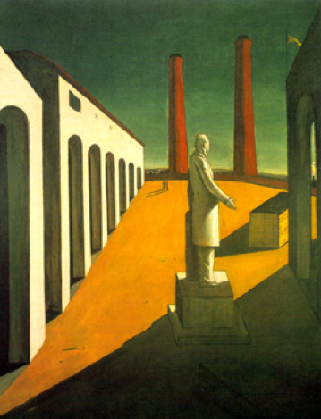
| The Enigma of a Day, 1914 Artist -De Chirico |
Chapter 2: Shadow play puppets and theatricality

|
Chinese traditional puppet theatre |
Chinese shadow play is said to date back around 2000 years or even earlier. It depicts stories containing romance, heroic adventure, fantasy and humour. All shadow puppets figures are controlled by three wires fastened to rods, a main supporting control and the two others that control the arms and hands, with the legs swinging freely. The main supporting rod being attached at a right angle to the head, so it is not visible on the screen. The origins of shadow theatre are not know but most academics agree it originated in the east where these ancient traditions still survive today. It is associated with religious ceremonies and held in the highest respect, more so than anywhere else around the world today. All the artists that follow in this essay were chosen because they link directly to ancient shadow puppetry theatres, as does my artefact because it tells a story to. The difference being my composition does not move, so to create movement I have used paint and silhouettes in action style stances. Mine were created with a scalpel and card, the same techniques and materials used in shadow theatre, this linking it directly with my artefact.
|
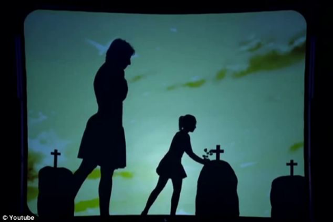
Attraction perform shadow theatre 2013 |
Today’s Shadow theatre performances use dancers, actors, and large theatre screens to increase the emotional effect on audiences. For example Britain’s Got Talent, a popular talent show that invites performers to enter the competition, and if selected they compete against the other contestants and are eliminated one by one until there is a final winner. In 2013 it featured a shadow theatre company called ‘Attraction’ who used ballet, and current emotionally charged music, to create a story of a couple meeting in London and falling in love, and having a child. The husband is sent off to war to his death, with the penultimate scene that of the young child laying flowers on her father’s grave holding the hand of her mother. The audience was visibly moved by the performance. With modern technology, great dramatic large screen backings, modern lighting and computer software, stunning performances can be created unlike years ago when the puppeteers only had a candle for light, silk screen and rigid inflexible puppets.
Chapter 3: Silhouettes
Silhouettes which unlike shadows are real and immoveable objects, are the earliest forms of arts history. From cave drawings portraying the world around them, to the silhouettes of Kara Walker whose work I will talk about further, nothing much has changed, other than the materials used and the detail that can be created today from modern inventions and tools. The appeal of this form of artwork is that you don’t have to be a great or talented artist to produce a simple and amazing piece of art, the materials are readily available and not hard to acquire, from ochre clay used to produce cave drawings to the simple black card used to produce silhouettes.
The silhouettes first became popular as artworks in the 18th Century as a cheaper alternative to miniature oil paintings. The name silhouette takes its name from the Marquis Etienne de silhouette (1709 – 1767) who was the controller general in France in 1759. Because of his severe measures to deal with the French economy anything that was mean or cheap was referred to as a la silhouette. At this time black cut-out portraits became very popular especially with the Marquis and the term was incorporated into the French vocabulary and was later adopted worldwide. The image left shows the process where a shadow falls on transparent paper which is then traced from the other side. The accuracy of the outline created by this technique gave rise to a theory that the character and personality of a person could be worked out just from the shape of their profile. This was called ‘physiognomics’.

Chapter 4: What does shadow/silhouette art mean for contemporary art
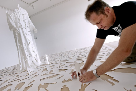
|
Peter Callesen creating Transparent God 2009 |

|
‘Youngman’ 2012. Noble & Webster |
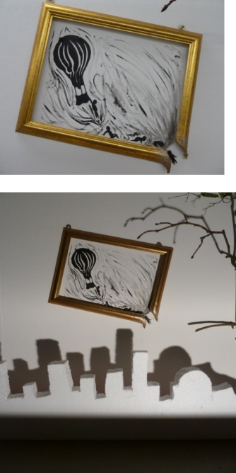
Shadow art in the contemporary world of art is often overlooked by many artists as being too simple and basic. This is the beauty of shadow art, because in the modern world those who practise ideas within the field are engaged in the simplicities of art. Developing a deeper understanding of the concepts that are used in shadow art to manipulate the shadows to appeal to a wider audience. Since the methods used are so simple yet executed so well, helps to convey a deeper message to the audience than what they see and conceive within in their own mind. Take Peter Callesen works for example he uses specific tools, such as a scalpel too create artwork out of simple A4 white paper which appeals too all and is readily available. My Artefacts shadow/silhouette work promotes movement in the brush strokes I have used and how the balloon looks like it is taking off. In the contemporary world of art which is hectic, this depicted movement in the artefact relates to how everybody wants to make things which are meaningful and relate to everybody. However in a rush to make this process and with differences in money and reputation some people get left behind in this race to be noticed in contemporary art, just like the person who is trying to catch the hot air balloon in my artefact work. Also shadow art helps root contemporary art, as the art form uses mainly Black and White as opposed to the heavy use of colour in today’s art world. We need shadow art in contemporary art as it helps add depth to many artworks for example, we need shadows within compositions too cause tension and add drama to the work. Just like the person in my artefact who is holding onto dear life onto the frame nearly plummeting into the city scape.
It’s a good skill and method too use to ground contemporary art and deliver simple yet meaningful messages. As the use of light and fire are natural elements born from the beginning of time, these elements always produce shadows, and I am trying to mix the old forms of shadow art with the newer forms of shadow art making it a very contemporary but simple, as the mediums and tools needed to produce my artwork is minimal.
My artwork In relation to the contemporary audience hopefully will be intrigued, due to the appearance of it being a common framed painting, but on closer inspection the audience will see the multiple 2d and 3d effects I have used to present shadows and silhouettes in a contemporary way.
Chapter 5: Contemporary Silhouette Art that tells a story
All the artists I will be exploring in this chapter use Silhouette Art, to create different stories that are emotionally poles apart. Kara Walker uses silhouette imagery that address serious issues, displayed on a white wall to create contrast. This is accepted and recognised by the viewer as carrying deep messages that make a point about human existence, and oppression and inhuman treatment of black slaves in the past. The other artists Lotte Reiniger and Jan Pienkowski use silhouette art to create stories for children, which carry light hearted messages of happiness and fantasy for entertainment. Opposite to Kara Walkers which carry a darker message of the destruction of black people and the portrayal of their chaotic lives. Though my framed artwork is nowhere near the horrors that Kara Walker portrays, it still carries a similar theme of destruction and chaos which is the essence of what my work is about, which links with Walkers work. Reiniger and Pienkowski link with Walker as they instil emotions within the viewer, just happier emotions, whether watching Reiniger’s films or Peinkowski’s books. Which ties all our artworks together that of creating different emotional responses within the viewer’s imagination.
Kara Walker was born in California in 1969. Through her silhouetted figures she explores themes of race, gender and sexuality deliberately creating feelings of shock and disgust in the viewer, and there is a theme of emotional seriousness to the stories or imagery she places her silhouettes in, thus creating an emotional feeling of shock and disgust for the viewer. Walkers themes explore the raw intersection of race, gender, and sexuality through her iconic, silhouetted figures. Walker’s silhouetted figures are serious and yet funny in style depicting her views of how black people were treated as slaves by their owners. When asked by Matthea Harvey the Guardian reporter, where the impulse to make the cut-out murals came from originally? Walker said; I think it goes back to when I first got to graduate school. I was 22. I was writing to find my voice, because I didn’t talk very much. This kind of Marquis de Sade stuff started coming out of me, which I didn’t know was there. I was writing on a typewriter in an open studio. A friend later called those my Unabomber writings. It was a release that was very real, disruptive and secretive. I think the cut paper has that same quality. [5] What Walker means by this is that she started writing in the style of Marquis de Sade who was famous for writing about sexual fantasies, violence, and unrestrained by morality erotic works. Also the Unabomber reference relates to a famous man called Theodore John “Ted” Kaczynski who was and American anarchist and domestic terrorist. Her friend by saying this was expressing Walkers written works had an anarchist style meaning they were rebellious and could cause trouble and discourse if allowed to be put on public display. Kaczynski was also against any new technology, so Walkers works relates to Kaczynski’s ideas around this theme, as cut paper silhouettes are an old style way of producing art, as to a typewriter is now outdated.
Kara is experimenting with the audience’s views of racism and how far she can take the contrast of a serious subject in a playful way. In essence Kara’s message is it’s not how you look or how you behave, but how you treat people is what matters. Kara’s work has two meanings and draws on her own history and the power struggle black people have experienced. Through removing a silhouette from the paper she is bringing their stories to life.

| ‘Grub for Sharks: A Concession to the Negro Populace’2004 |
Her cut outs relate to old historical events and express artistically her feelings on these themes. Through the use of dark silhouetted figures she shows how black people have been persecuted, and treated as a commodity as opposed to human beings, through artwork depicting slavery, for example the work ‘Grub for sharks: A Concession to the Negro Populace’ 2004. It depicts the practice of throwing slaves over board to their deaths when the cargo needed to be lightened, for example when a storm was threatening to sink the slave ship. The silhouettes Walker portrays on the walls of the gallery are used to shock and stir emotions from deep within the viewer of sadness, sympathy and horror. The shadows are sometimes disfigured and distorted accentuating the theme of tortured souls.
Hilton Als, journalist for the New Yorker Magazine said; ‘In 2000, Walker gave a talk at the Des Moines Art Center. Afterward, a white man in the audience asked her how long she intended to make the type of work she did. Walker responded, “Oh, probably as long as I’m black and a woman.” [6] Hilton Als says; (This exchange has been quoted as an example of Walker’s “fearlessness,” with Walker depicted in the press as the art community’s very own Sojourner Truth, a paragon of black righteousness in a corrupt white world—an image that Walker, who has said that she occasionally feels like “somebody’s pet project,” which she is very much aware of. [7]) By this she means she will not be controlled by what people say or think about her work, or have her work characterised by other people in pursuit of their own gender and race agendas. (Sojourner Truth, was a female African-American slave and abolitionist and women’s right activist who escaped slavery)


|
The fairy tale films andnThe adventures of Prince Achmed |
A further artist whose work I have studied which links with the work of Kara Walker’s silhouette theme, is Lotte Reiniger. She was born in Berlin in 1899, a prominent silhouette animator according to Philip Kemp, no one else has used her specific animation technique, making it utterly their own ‘To this date she has no rivals and for all practical purposes the history of silhouette animation begins and ends with Reiniger’ [8] Altogether Reiniger made nearly sixty films, of which forty survive. Firstly she was attracted to longer fairy tale films, but in later years made short animation pieces. Reiniger was self-taught and from an early age had an ability to cut free handed paper silhouettes, which she used in her own home made shadow theatre. Her first job was for the film director Paul Wegner for whom she made silhouettes that were shown in the intervals of his films. She then joined the experimental animation studio Berliner Institut fur Kulturforschung. But when the Nazis seized power Reiniger left Germany with Carl Koch a member of the animation studio and travelled to England in December 1935. Reiniger said; ‘because I didn’t like this whole Hitler thing and because I had many Jewish friends whom I now was no longer allowed to call friends’. [9] In England Reiginer went on to make many more films until her death in 1981
|
Illustration from Pages 2 & 3 from the book A Thousand Nights and One Night, 2007 |
Another artists who also links with my artefact theme is Jan Pienkowski, famous for his illustrations in children’s literature. He uses paper cut illustrations in the form of silhouettes which have close similarities to the ancient shadow puppetry theatres of the past, as do all the above mentioned artists, which also links strongly to the artefact that I have produced, inspired by the artists I have chosen to research. In an interview with the Book Trust an online resource to promote reading in children Pienkowski said; “I got this tremor in my right hand and couldn’t draw a straight line,” he explains; “So I would say that it didn’t occur to me to use cut-outs until The Thousand Nights and One Night, and that was because of the tremor.” [10] This explains why he started working with the medium of cut out silhouettes, Pienkowski would still draw the images, and then pass them on to colleague with a steadier hand, to cut them out with a scalpel.
In the next two chapters I will be exploring the work of modern conceptual artists who use recycled objects in diverse and imaginative ways to produce amazing paper and shadow artworks through hours of pain stacking patience and creativity.
Chapter 6: 3 Dimensional Paper Art
Carrying on from previous chapters but adding another dimension, Peter Callesen artworks start as silhouettes initially, and then turns into 3 Dimensional artworks, which is inspirational and one wonders how this is achievable. His theme is bringing the silhouette to life by creating depth, and space, he also leaves a lot of negative space behind in this process, which holds just as much value artistically as the finished 3 Dimensional artworks.
Peter Callesen is a Danish artist who creates seemingly impossible sculptures from something as fragile and mundane as A4 sized white paper. Callesen takes an unambiguous sheet of white paper and transforms it to a state of metamorphosis, into a delicate fragile sculptures that seems to be alive. He carefully considers the contrasts between positive and negative space. He possesses an ability to understand intricate shape analysis and how to join silhouettes cut outs to great effect, to make a bigger and better sculpture from the jigsaw of shapes he has chosen to cut out. Although he sometimes trims the paper he removes, he never adds to the silhouettes he cuts out. Callesen uses very simple tools like scalpels and he has adapted tools himself to create certain effects for example stretching and curving the paper. For very delicate work he uses dentistry tools in order to glue and work the paper to the desired effect. Having a basic training in architecture has helped him when creating his architectural masterpieces. A quote by Callesen taken from an architects website Callesen says; “By taking away all the information and starting from scratch using the blank white A4 paper sheet for my creations, I feel I have found a material that we are all able to relate to, and at the same time the A4 paper sheet is neutral and open to fill with different meaning. The thin white paper gives the paper sculptures a frailty that underlines the tragic and romantic theme of my works.” [11] This statement explains in some way why he prefers to work with the medium of paper.
His first big break was in 2003 when he was asked to participate in the Amorph festival of performative arts in Helsinki, for which he made a floating Styrofoam castle for the show, and a smaller paper template cut out castle for the show’s catalogue, which had to be cut out and put together by the reader. Since then he has become best known for his paper sculptures, and not his early work in painting, video and performance arts.
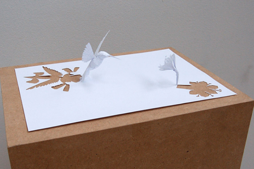
|
’Distant Wish’, 2006 Peter Callesen |
The image ‘Distant Wish’ 2006 of a bird and a flower looks natural, as when the bird approaches the flower it becomes a moment frozen in time. It is clever how he uses shapes that take time and effort to create a realistic look. As with my balloon composition and Cityscape Artefact Callesens work uses similar techniques as it is part 2d and part 3d giving a natural real life effect, and also keeping the audience guessing. Since they need to take several looks at the work to determine how he has created this 2d/3d effect and what message is he trying to communicate, which is what I am trying to achieve. Callesen heavily relies on contrast in his work as I do. This provokes thought in the audience and is similar to my work which uses shadows, silhouettes and recycled rubbish to show the difference between the initial material and how light and dark can produce another artwork separate from the first, as his cut outs are being artworks in themselves, as well as the sculptures he produces. Two for the price of one as it were. This is similar to my recycled items, the rubbish being one artwork, and this making a second shadow artwork to stand on its own.
Chapter 7: Contemporary Shadow Art created from recycled items
In this Chapter the theme will be contemporary artworks made from recycled items, rubbish and collected items, that create stunning pieces of Shadow Art. How a pile of rubbish can be transformed into a recognisable image by the flick of a switch.
Tim Noble was born in Gloustershire in 1966 and Sue Webster was born in Leicester in 1967. They met at Nottingham Polytechnic in 1986. They have been making art together for two decades, putting themselves into their work over the years by working collaboratively. Much of their work is concerned with the body, love and being close to each other. In the book ‘Nihilistic Optimistic’ Noble states; “When we’re in the studio we need to get out, cos we’re in the dark and you end up going for a little walk, down the alley way, trying to avoid people, and there would be one solitary chair that someone has put out, but very meaningful, almost like it’s sitting there, sadly, on its own.” Webster continues “it’s almost like a gift as if someone had actually presented it to us. Sometimes I’ll go for a walk and bring something back, and Tim’ll go, ‘I was looking at that yesterday’. All the stuff in the new show is from the streets around here-unwanted things that have been thrown out.” [12] Noble and Webster by using common recyclable material they collect from the streets, produce shadow art that is realistic and recognisable when a light is projected upon it. Their shadow art moves in a fluid way and it doesn’t have a set form as extra towers of rubbish can be added to create the same shadow of a man but with the limbs and body stance altered slightly. It can be moved to different positions, as shown in the image ‘Youngman’ 2012 in chapter 4. As the final shadow is created by individual towers of rubbish, that when lined up correctly create the completed image. When interviewed by Hans Ulrich Obrist about when did the shadow pieces enter their works, in the book Nihilistic Optimistic, Sue Webster said; “So we were working on making sculptures with electricity and light bulbs, but we had to make them in the dark…” Webster stating; “Yeah, we used to leave the light sculpture on because we had no money for heating, and they would warm up the studio. We used to fiddle the electricity meter so we had these light bulbs running around the clock. I think I walked into the studio one day and the silhouette of my profile was on the wall, and it was so precise that Tim wanted to draw round it.” [13] Webster is explaining how by chance the idea of creating shadow art originated from.

|
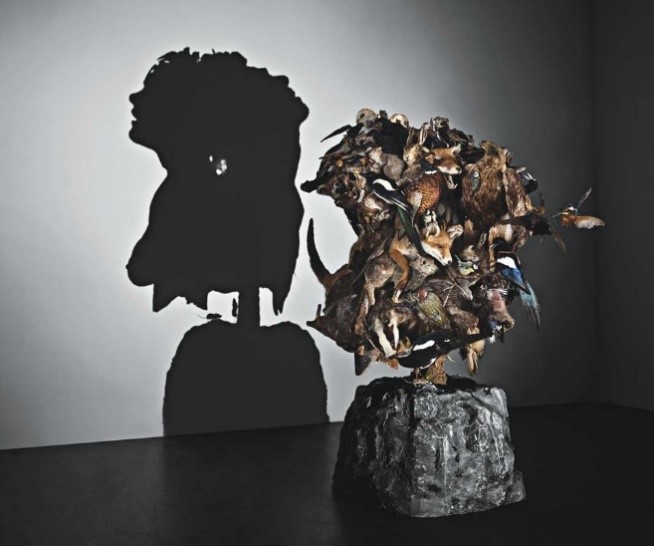
‘The Game Keeper’s Gibbet’ 2011. Noble & Webster. |
The shadow artwork ‘The Game keeper’s Giblet’ 2011, is made from recycled animal material comprised of frog’s, squirrels, a mouse, a rat and bird parts including birds feet. The creatures are bound together with a coiled rope and then gilded with pure gold. An interview conducted by Louisa Elderton in the book Turning the Seventh Corner, Sue Webster explains who the idea for mummification of animals came about, for the artwork ‘The Game Keeper’s Giblet’ 2011. Webster said; “…being and artist you collect things and you don’t know why; all you know is that one day they will come in useful for something. Tim’s mum lives in the countryside and she had just bought two kittens. I remember going to visit her two or three years ago and while I was sitting watching the telly I moved the sofa back and I found a ball of fluff. I picked it up and blew on it only to reveal a dried frog. And then I found something behind the television, and asked if this happens all the time and she said, “Yeah it happens every day.” [14] Sue Webster goes onto explain in the same interview that she gave Tim’s mum a box with dead things written on, and asked her to keep everything the cats killed, and keep it for her to collect every three months. After that mummification of animals has been a fascination for Noble and Webster, becoming interwoven with their artistic practice. When the viewer realises that dead animals are used to create the shadow it can cause emotions of shock, disgust, sadness. The work creates a contrast of humanity, one made from death. It is 3d and is stacked on a spike which has negative connotations for example, criminal’s heads in the past were displayed this way to scare the public and keep order.
For my artwork I have used other materials that are not living, polystyrene, black card, wood, plastic, and paint. These materials are inanimate objects, and the way I have arranged them creates emotion through the shadow alone. My Hot air balloon piece also shows the theme of death, similar to Noble & Webster’s as the silhouette figures are plummeting to their death. It is within a frame, so the composition is detached and separate from the shadow cityscape below, but is still part of it, so the whole composition is still joined which adds depth to the artwork as a whole.
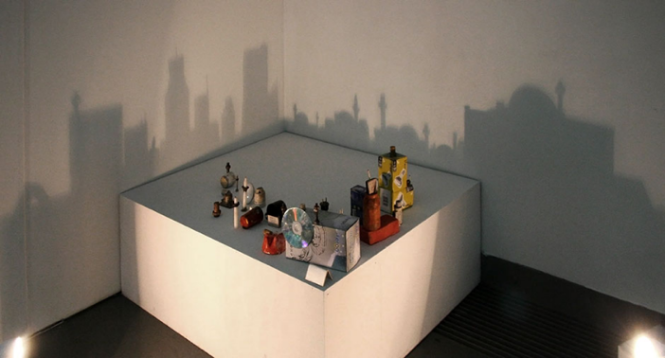
|
Looking At One City from Two Viewpoints. 2001. Rashad Alakbarov |
Another artist who uses recycled material to make artwork is Rashad Alakbarov his cityscapes and other shadow artworks, inspired me to create my cityscape artefact.
Alakbarov collects mundane items and cleverly uses them to create shadows which have everyday meanings. The artwork is raised higher than the light which makes the Cityscape shadows larger and more impressive when thrown onto the gallery walls. Alakbarov also uses recycled rubbish hung from wires like a mobile, it moves and is fluid. Only when the wires are still and bottles or plastic coloured Perspex fall in line, does a recognisable shadow form on the wall.

|
Portrait made of Bottles 2011. Rashad Alakabarov |
Other artist that use similar methods are Diet Wiegman and Kumi Yamashita, whose artworks I have studied in detail.
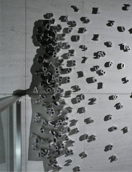
Yamashita uses sideways light which shows a womans profile made from wooden number blocks. The setting for ‘City View’ 2003 was in a business centre and it adds to the business-like theme. My artefact links with all the artists in this chapter as they do with each other, as we all use the same techniques and similar materials to create a shadow artwork.
|
City View (close up), 2003. Kumi Yamashita |
‘City View’ 2003 creates the feeling of a picture that isn’t completed, however when looking at the larger picture, it can be seen as a whole and makes sense. The separation of the objects promotes the audience’s creative side allowing it to look at different parts of the artwork individually which communicates different messages. Similarly my Hot Air Balloon composition within a separated frame, and cityscape below is a theatrical spectacle with a lot going on. By looking at all the different parts of the artwork, the viewer also can interpret different meanings.
Kumi Yamashita was interviewed by Andy Butler who works for Designboom an online source for artists. Butler asked; “You seem to work mostly with light and the manipulation of it to form shadows what attracted you to this way of working?” Yamishita said; “Mainly because I love looking at light and shadow. I remember sitting on the patio of my family home in the late autumn afternoon. The sun was setting and was casting the shadow of swaying branches of our fragrant olive tree on the ground. The colour of the light was gradually changing from warm orange to cool blue as the shadow of the tree stretched and faded away. In my young mind I questioned the permanence and ephemera of all living things as the tree stood soundly in front of me in the almost monochromatic landscape. For me, shadows came to symbolize another dimension of life, perhaps something even more real than its holder.” [15] What Yamashita means by this is that for one moment in time for her, shadows became more important to her than the life that casts the shadow, as sort of epiphany a sudden great realization how shadows can be used, enjoyed and exist even though it may be for a short time as they do not last forever.
|
Shadow Dancing 2008. Diet Wiegman |
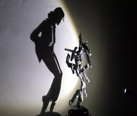
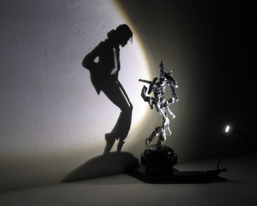
Finally Diet Wiegman who has been making beautiful shadow sculptures out of trash, scrap metal and other objects for almost 50 year. He uses techniques along the lines of Noble and Webster but with a twist, literally. Wiegman’s artwork ‘Shadow Dancing’ 2008, is created from junk that is placed on a rotating pedestal, As the sculpture turns it sways and morphs into the iconic pose of the late Michael Jackson, only to disappear again once the trash is no longer in alignment.
Wiegman relates to my work as he uses distance, and light and recycled rubbish as I do, Creating shadow artworks that only look recognisable when the lights are switched on, and the shadow is formed, the original discarded rubbish materials looking nothing like the shadow they produce.
Chapter about 8: How the research links with the Artefact
I decided to start my research right from the beginning of time as shadows have always been present in our world, which is clear from the introduction I wrote at the beginning. Then I traced the shadow and its other half as it were the silhouettes from their earliest forms and uses in art, right through to their contemporary possibilities in art for them both today.
I purposely chose to research artists that worked with these two mediums, both old and contemporary artists, but making sure that the older artists were still current and relevant into today’s society and culture.
All the research I have done to date relates to my artefact which includes both shadows and silhouettes, it encompasses both old shadow puppet art, and more contemporary styles of art which use recycled rubbish, to create interesting, diverse and surprising artworks, similar in theme to the artworks of the artists mentioned in chapters 5, 6 and 7.
Conclusion
In summary, I was attracted to working with shadows as an art form last year, when I created sculptures that incorporated shadows as a by-product of the sculptures I created. I incorporated lights within and around them, in order to create atmosphere and give my work the wow factor and generate interest within the viewer. The fact that shadows are not real, can be changed, only exist if light is present and an object there to block the lights path, interests me. As does the fleetingness of the shadow. This year through experimenting with many different techniques such as: Light work, cutting, positioning, and movement, I created a 2D and 3D composition using both silhouettes and shadows, from black card and discarded materials I have picked up in skips. Having been able to manipulate my ideas in relation to shadows and access the darker emotions of death, destruction, uncertainty and chaos which are not commonly exposed within regular artwork. This linking with Kara Walkers themes, that relate to slavery and Noble and Webster’s themes of death and mummification. Adding a second dimension to my artwork which links my work with Peter Callesen. Rashad Alakbarov, Diet Wiegman, Kumi Yamashita, Tim Noble and Sue Webster, who also use recycled rubbish to make 3D sculptures, that go onto create the shadow compositions.
The Artists and art forms I have explored within my Reflective study, produce shadow based work, experimenting with darkness which naturally triggers emotions, which can be uninviting. For example if you open a door into a house with no lights on it triggers the feelings of uncertainty and insecurity of the unknown. When Tim noble and Sue Webster exhibit their work in dark rooms with only one light, this triggers similar emotional responses within the viewer. In relation to my work, I am trying to trigger similar feeling and emotions within the viewer that shadows do.
My city scape produces darkness below a multi-dimensional layered artefact, the figures who are falling from the balloon into the darkness, produces emotions of destruction and chaos within the viewer. The aggressive brush work surrounding the balloon adds to the lack of control. The inevitability of the silhouettes situation, one of plummeting to their death, transfers this message of sudden death and dark narrative to the viewer. Similar themes to my research from early shadow theatre narratives right through to the modern contemporary shadow artists I have researched. Shadow artists can play within the realms of darkness and their experimentation allows them to access emotions which are not often accessed within other art forms. Due to shadow art being a small sector of contemporary art, the beauty of shadow art is its simplicity as are the methods used to create it, each shadow art has a unique path of creation, this uniqueness, can relate to the viewer and create emotional response of surprise and amazement, as to what can be created from unambiguous simple materials, which isn’t often triggered with regular artworks. For example, through creating a cityscape shadow rather than simply painting a cityscape, one creates a second piece of artwork, the Silhouette composition above the city brings out a different dimension of the city, which will trigger a different negative set of emotions
I have taken in a lot of information and ideas from various sources and developed it into a piece of artwork that incorporates my own ideas techniques and themes, that relate to the artists I have chosen to research. I have enjoyed the process of research as it has helped focus my ideas and brought clarity to exactly why I have used certain methods within my work. The fact that my work is multi-dimensional and has used different methods, shows that I have understood and transferred the knowledge I have gained through my research to inspire me in the creation of my artefact.
I have enjoyed experimenting with different methods of shadow creation and this in essence has led to the creation of my piece.
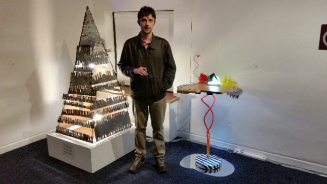
My Artefact is located in the Waterhouse building, in the back room, on the back wall.

| My Cityscape Artefact |
Bibliography
Primary Sources [eg. Exhibitions, contact artist directly, interviews]
Exhibitions visited
Paris
Musee D’Orsay, Paris. Le Douanier Rousseau L’innocence Archaique exhibition from 22nd March to 17th July. [Visited 4/5/16] [Proof see exhibition brochure and receipts]
Au Musee Du Louvre, Saison XVIIIE, Hubert Robert Exhibition, A L’Ombre Des Frondaisons D’Arcueil Exhibition and also Un Musse Revolutionnaire Exhibition. [Visited 2/5/16] [Proof see exhibition brochure and receipts]
L’Espace Dali, Salvador Dali Sculptures and Graphic Artworks museum, 11 rue Poulbot, Paris 18. [Visited May 2016] [Proof see Exhibition brochure]
London
Tate Modern, Boiler House Exhibitions, ‘Art From 1900 to Now’ and the Switch House Exhibitions ‘Art From 1960 to Now’ [Visited 7/8/16] [Proof see exhibition brochure and receipts]
Victoria and Albert Museum, ‘Undressed Exhibition’ [visited 8/8/16] [Proof see exhibition brochure and receipts]
Jerwood Solo Presentation. Artworks by Lucy Parker, Rachael Pimm and Katie Schwab. 27th July – 28th August 2016. [Visited 10/8/16] [Proof see Exhibition brochure]
Newcastle
The Laing Gallery Alice in Wonderland Exhibition. From 14 May – 2 October 2016. The Laing Gallery, Newcastle, England. [Visited 21st July 2016] [Proof Exhibition brochure and receipts]
Baltic, Exhibition:-Ground Floor, Christiana Soulou, 25th June – 25th September 2016
Baltic, Exhibition:-Level 2, Jumana Emil Abboud, 6th May – 2nd October 2016
Baltic, Exhibition:-Level 3, Caroline Achaintre, 15th July – 30th October 2016
Baltic, Exhibition:-Level 4, The Playground Project, 15th July – 30th October 2016 [Visited all 4 on 20/7/16] [Proof see exhibition brochure and receipts]
Middlesbrough
Teesside University Fine Art Degree Show, ADORNITY. [Visited May 2016]
Teesside University MA fine Art Show, Delicious Edge. [Visited September 2016]
Mima, Jane and Louise Wilson, ‘Undead sun: We put the World Before You’. 1st October 2016 – 15th January 2017.
Mima Winifred Nicholson, ‘Liberation of Colour’ 22nd October 2016 – 12th February 2017.
Blah Blah various exhibitions
York
York Art Gallery, York, England. [Visited 7/6/16]
Yorkshire Museum, York, England. [Visited 7/6/16]
York Castle Museum, York, London. [Visited 26/8/16]
Secondary Sources [eg. Books, Websites, Journals, Films.]
Books
Books: Introduction
Casati, Roberto. Translated from the Italian by Abigail Asher, Shadows, Unlocking Their Secrets, from Plato to Our Time. Published by Vintage Books, Random House Inc. New York. 2004. [Page 7]
Books: Chapter 1
Gombrich, Ernst. Shadows The Depiction of Cast Shadow In Western Art. Published by the National Gallery Publications Limited.1995. Published to accompany an exhibition in the Sunley Room at the National Gallery, London 26 April-18 June 1995. [Page 6, 19, 20, 21, 25, 26]
Books: Chapter 2
Currell, David. Shadow Puppets and Shadow Play. Published by The Crowood Press Ltd, Wiltshire, England. 2007. [Pages 17, 23, 24]
Books: Chapter 3
Currell, David. Shadow Puppets and Shadow Play. Published by The Crowood Press Ltd, Wiltshire, England. 2007. [Page 12]
Gombrich, Ernst. Shadows The Depiction of Cast Shadow In Western Art. Published by the National Gallery Publications Limited.1995. [Page 31]
Books: Chapter 4. None
Books: Chapter 5
Kara Walker.
Gale, Matthew edited. The Tate Modern the Handbook. Published by Tate Publishing. London. 2016. [Page 315]
Jan Pienkowski.
Walser, David. The Thousand Nights and One Night. Published by Pengin Group. London 2007. [Pages 2 & 3]
Books: Chapter 6
Manco, Tristan. Raw + Material = Art, found, scavenged and upcycled. Published by Thames & Hudson Ltd. London. 2012. [Pages 52 – 55]
Books: Chapter 7
Tim Noble and Sue Webster
Yablonsky, Linda. Noble & Webster. Athens: DESTE Foundation for Contemporary Art, 2014. [Page 129]
Noble, Tim. Webster, Sue. ‘Nihilistic Optimistic, Tim Noble & Sue Webster. Published by Blain|Southern. 2012. [Pages 17 & 99]
Noble, Tim. Webster Sue. ‘Turning the Seventh Corner’ Published by Blain|Southern. 2011. Published on the occasion of the Exhibition Turning the Seventh Corner. 30th April – 16th July 2011. [Pages 13 & 33]
Books: Chapter 8. None
Books: Conclusion. None
Articles and other printed material e.g. Journals etc.
Film and videos:
Lotte Reigner
Reigner, Lotte. Lotte Reigner, The Fairy Tale Films, PG, BFI DVD.
Reigner, Lotte. The Adventures of Prince Achmed, PG, BFI DVD.
Additional material e.g. websites etc.
Websites
‘Kara Walker @ Crocker Art Museum’ 2013. http://www.squarecylinder.com/2013/12/kara-walker-crocker-art-museum/ [Accessed 06/10/16 at 2:33 pm]
http://www.art21.org/artists/kara-walker [Accessed 06/10/16 at 2.39 pm]
Alakbarov, Rashad http://rashadalakbarov.com/en/biography/ [Accessed 14/10/2016 at 12:52pm]
http://www.petercallesen.com/paper/a4-papercuts / [Accessed 28/10/16 at 11:39 am]
http://www.newyorker.com/magazine/2007/10/08/the-shadow-act [Accessed 7/11/16 at 8.17 pm]
http://www.newyorker.com/magazine/2007/10/08/the-shadow-act [Accessed 7/11/16 at 8.21 pm]
http://weirdfictionreview.com/2012/07/tim-noble-and-sue-webster-give-a-few-extra-turns-of-the-screw/ [Accessed 11/11/16 at 2.20 pm]
http://www.theverge.com/2013/3/21/4130960/the-incredible-shadow-dancing-light-sculptures-of-diet-wiegman [Accessed 21/11/16 at 9.31pm]
https://www.theguardian.com/artanddesign/2015/sep/27/kara-walker-interview-victoria-miro-gallery-atlanta [Accessed 11/1/17 1.49 pm]
http://www.designboom.com/art/kumi-yamashita-interview-03-05-2015 [Accessed 13/1/17 9.53 am]
http://www.arch2o.com/paper-cut-sculptures-peter-callesen/ [Accessed 13/01/17 3.30 pm]
http://www.booktrust.org.uk/books/children/illustrators/interviews/111 [Accessed 13/01/17 3.22 pm]
Online videos
Attraction perform their stunning shadow act – Week 1 Auditions | Britain’s Got Talent 2013https://www.youtube.com/watch?v=a4Fv98jttYA [Accessed 15/11/16 at 7.11pm]
‘Shadow Dancer’ Diet Wiegman. http://dietwiegman.tumblr.com/Videos [Accessed 21/11/16 at 9.11pm]
Table of illustrations
Front cover image:
My Cityscape Artefact
Image 1:
Artist: a follower of Rembrandt or his school, 1606 – 1669. ‘ A man seated at a Table in a Lofty Room’. Date made: 1628-30, Oil and oak, 55.1 x 46.5 cm. Location: National Gallery, London, Room 16, inventory no. NG3214, acquired 1917.
Image: https://www.nationalgallery.org.uk/paintings/follower-of-rembrandt-a-man-seated-reading-at-a-table-in-a-lofty-room [Accessed 26/10/16 at 7.35 pm]
Image 2:
De Chirico: The Enigma of a Day, 1914. Oil on Canvas, 83 x 130cm. Brazil, Museu de Arte Contemporanea da Universidade de Sao Paulo.
Image: http://www.radford.edu/rbarris/art428/surrealism%201.html [Accessed 15/11/16 at 6.05 pm]
Image 3:
Chinese traditional puppet theatre
Image: http://www.theaterfigurenmuseum.de/en/ausstellung/sonderausstellungen/asien.html [Accessed 26/10/16 at 7.21pm]
Image 4:
Modern shadow theatre performers: Attraction
Image: http://www.dailymail.co.uk/tvshowbiz/article-2333630/Britains-Got-Talent-Attraction-Behind-scenes-amazing-dancers-tipped-win.html [Accessed 15/11/16 at 7.18 pm]
Image 5:
Image of machine used to create silhouettes
Image: –http://cabinetmagazine.org/issues/24/stoichita.php [Accessed 9/11/16 at 6.01pm]
Image 6:
‘Youngman’ 2012. 1 wooden stepladder, discarded wood, light projector. Sizes: 338.5 x 58 x 213.5 cm (1331/4 x 225/6 x 84 in)
Image: http://www.timnobleandsuewebster.com/youngman_2012.html [Accessed 18/11/16 at 11.08 am]
Image 7:
Image of artist Peter Callesen creating ‘Transparent God’ 2009.
Image: http://dinby.dk/touristupdate/saa-er-der-igen-adgang-til-hemmelig-bunker-kunst [Accessed 18/11/16 at 10.42 am]
Image 8:
‘Grub for Sharks: A Concession to the Negro Populace’. Date2004. Cut paper. Overall display dimensions variable. Tate – not on display. Presented by the American Fund for the Tate Gallery 2009
Image: – http://www.tate.org.uk/art/artworks/walker-grub-for-sharks-a-concession-to-the-negro-populace-t12906 [Accessed 16/10/16 at 6.45 pm]
Image 9:
Image of Dvd’s front covers of Lotte Reiniger’s films
Image: –https://www.amazon.co.uk/Lotte-Reiniger-Fairy-Tale-Films/dp/B001EJW0UY [Accessed 7/11/16 at 5.55 pm]
Image:-https://www.amazon.co.uk/Adventures-Prince-Achmed-DVD/dp/B00005LIQ7/ref=pd_sbs_74_img_0?_encoding=UTF8&psc=1&refRID=ASHVFC2A14CJHCCD8ME9 [Accessed 7/11/16 at 6.07 pm]
Image 10:
Image of Illustration by Jan Pienkowski from Pages 2 & 3 from the book A Thousand Nights and One Night, 2007
Image:-http://www.janpienkowski.com/books/papercut/1001/1001nights.htm [Accessed 7/11/16 at 7.12 pm]
Image 11:
‘’Distant Wish’’, 2006. Acid –free A4 115 gsm paper and glue. Size unknown.
Image: http://www.petercallesen.com/paper/a4-papercuts/ [Accessed 28/10/16 at 11:42 am]
Image 12:
‘‘The Game Keeper’s Gibbet’ 2011. Tim Noble & Sue Webster. Solid sterling silver gilded in pure gold, metal stand, light projector plus installation with indirect fluorescent lighting, sculpture: 71 x 42 x 160 cm (27.95 x 16.54 x 62.99 in.
http://weirdfictionreview.com/2012/07/tim-noble-and-sue-webster-give-a-few-extra-turns-of-the-screw/ [Accessed 11/11/16 at 2.20pm]
Image 13:
‘Looking At One City from Two Viewpoints.’ 2001. Rashad Alakbarov. Mixed objects, spot lights, relay switcher, dimensions variable.
Image: http://rashadalakbarov.com/en/works/installations/2001/looking-at-on-city-from-two-viewpoints/ [Accessed 11/11/16 at 14:54 pm]
Image 14:
‘Portrait made of Bottles.’ 2011. Rashad Alakbarov. plastic bottles, spot ligh.t Size unknown
Image: http://rashadalakbarov.com/en/works/installations/2011/bottle-portrait/[Accessed 21/11/16 at 8.02 pm]
Image 15:
City View (close up), 2003, 250 x 500 x 5 cm, aluminum numbers, single light source, shadow (Photo courtesy of Kumi Yamashita)
Image: http://www.forbes.com/sites/yjeanmundelsalle/2015/04/25/kumi-yamashita-plays-with-shadows-to-create-art/#3ec3878166d4 [Accessed 21/11/16 at 8.27 pm]
Image 16:
‘Shadow Dancing’. 2008. Diet Wiegman material rubbish. Size unknown.
Image: http://www.theverge.com/2013/3/21/4130960/the-incredible-shadow-dancing-light-sculptures-of-diet-wiegman [Accessed 21/11/16 at 9.38 pm]
Image 17:
My Cityscape Artefact
Image 18:
My Cityscape Artefact
Appendix B Images: 19 – 28.
Photos of developmental work and process for creating Cityscape Artefact
Appendix A
Art Galleries Visited
Paris
Louvre Art Gallery, Paris, France [Visited 2/5/16]
Museum D’Orsay, Paris, France [Visited 4/5/16]
L’Espace Dali, Salvador Dali Sculptures and Graphic Artworks museum, 11 rue Poulbot, Paris 18. [Visited 5/5/16]
York
York Art Gallery, York, England. [Visited 7/6/16]
Yorkshire Museum, York, England. [Visited 7/6/16]
York Castle Museum, York, London. [Visited 26/8/16]
Newcastle
Baltic, Newcastle, England [Visited 20/7/16]
Laing Art Gallery, Newcastle, England [Visited 21/7/16]
London
Tate Modern, London, [Visited 7/8/16]
Victoria and Albert Museum, London. [Visited 8/8/16]
Jerwood Visual Arts Gallery, Jerwood Solo Presentations, London. [Visited 10/8/16]
Reveal Printmakers Art Gallery, London. [Visited 10/8/16]
Middlesbrough
Mima [visited various dates]
Blah Blah [visited various dates]
Yorkshire
Yorkshires Sculpture Park, Wakefield, West Yorkshire [Visited 14/12/16]
Appendix B
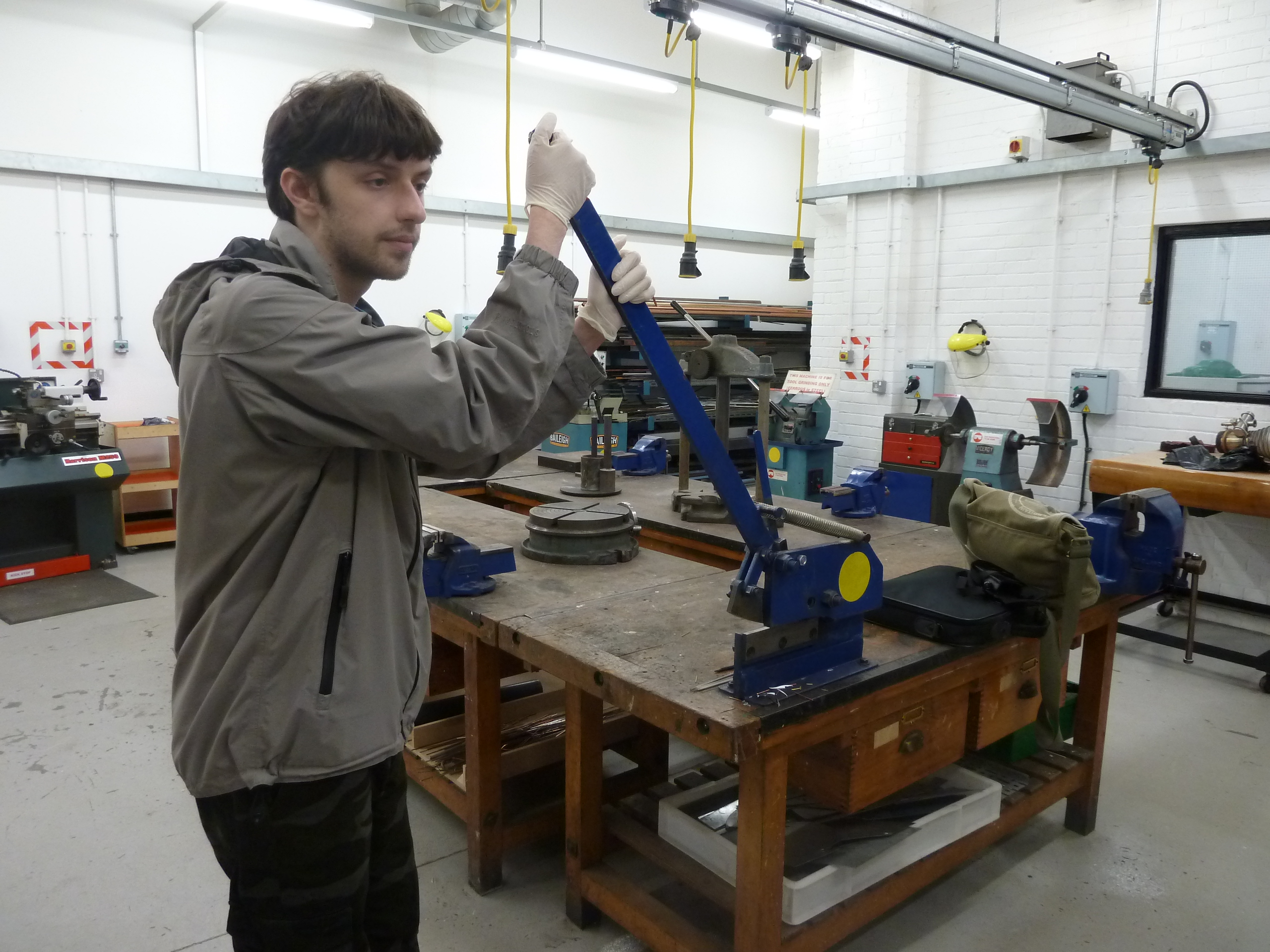
Photos of developmental work and process for creating Cityscape Artefact

First of all I had the idea to use an old frame that I had previously collected for my Artefact. And to incorporate shadows and silhouettes within the piece of artwork I would create.
I wanted to show a dramatic scene within the frame in silhouette form, and the idea of a hot air balloon being tossed around in a storm and people falling out of the balloon and frame, clinging on for dear life just sprung to mind. Also I wished to incorporate a cityscape below it made from recycled materials, casting a shadow on the wall, so using 2D and 3D within the same Artefact.
To achieve a gap in the frame I used a hot air gun to melt the plastic frame and I tried to sculpt a dripping affect at the end of the gap as though it had been melted, this was for another idea I had in mind, that of a hand holding a match.
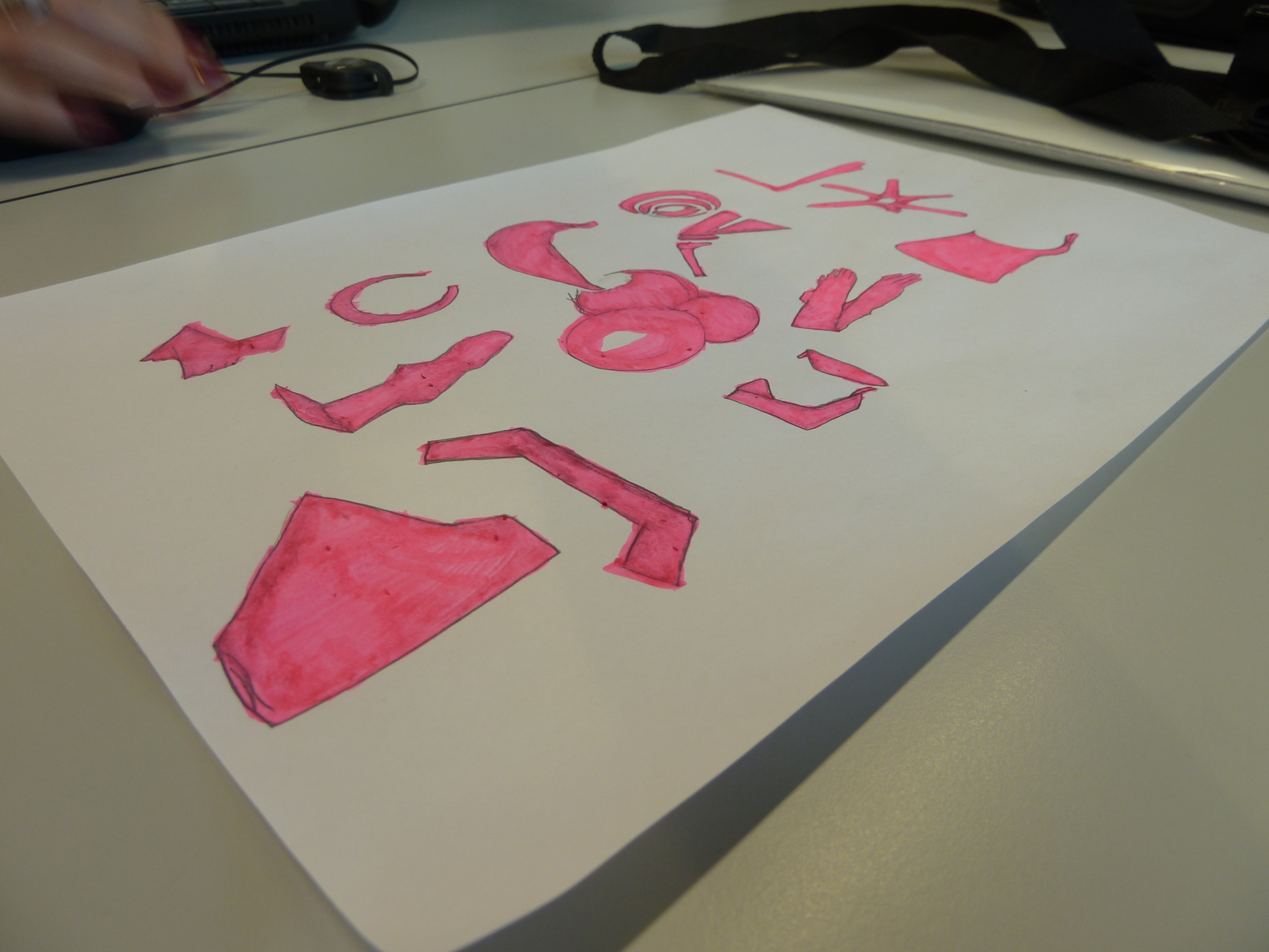
I had been practising with cutting out silhouettes from black card for other experimental artworks, so was getting better at controlling the scalpel when cutting out intricate pieces. I cut out a hot air balloon and five small figures, in various bodily positions of grasping, sliding and tumbling.
In order to hang the frame in a tilting position, I screwed metal frame hooks at an angle so the frame was aligned in a falling position, this made it look more realistic.
I then painted the area surrounding the silhouettes with black acrylic paint in order to create movement within the scene, representing swirling wind or a tornado.
To create the 3D cityscape I decided polystyrene would be the best material to use. I did not want it to look perfect and wished it to look rough in appearance this was in order for it to appear childlike as the silhouette figures did. To achieve this I did not draw an outline on the polystyrene but just cut randomly using my gut feeling, with a plaster board saw which also did not produce precise neat cuts, and this created the desired effect.
The shadow was created by a light source pointed onto the cityscape ideally from below. The cityscape could not be placed too near the ground, to achieve the best results, which was to achieve a tall high shadow thrown on the wall behind. Photos of it been taken after daylight created the best effect. Whilst experimenting with places to display my Artefact, unfortunately every room had a window, so I would go after sunset to take photos.
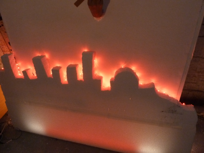
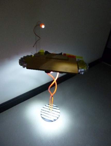
Originally I had only wished to create a shadow of a less than perfect cityscape on the studio wall, but then I had the idea of the cityscape been on fire, and this image may convey a fire had contributed to the frame above melting.

As it was Xmas there were lots of different lights in the shops.
So I experimented with red fairy lights, duck taping them to edges of the polystyrene. It did actually give the slight appearance of flames, jumping from the edges of the cityscape. Also I used a fluorescent light on the floor behind the cityscape, which I had cello taped Perspex sheet over and then painted with red acrylic paint, to produce the appearance of a red glow rising up from the cityscape.
Unfortunately the extra red lights counteracted the shadow been produced and thrown onto the wall. So you could either have the appearance of burning cityscape or a shadow of a cityscape not both at the same time. Two for the price of one as it were.

The idea of the hand holding the match could now be placed into the composition, in a position that looked as though it had been used to melt the corner of the picture frame. For the match I used a piece of wood with the end painted red initially, but then painted it black as though it had been used. The hand was a manikin hand I found discarded.
The photos on this page are photos with the shadows and without the shadows.
The photo left with the shadows only involved using one white light source pointed directly at the Cityscape artefact from the front.

Below is a photo of the Cityscape artefact with the fluorescent light, red fairy lights and original white light switched on at the same time.

So there are two possible effects to choose from when viewing the artefact. The viewer has to only to decide which lights they wish to leave off or on. I encountered problems taking photos in the Waterhouse which I had not previously thought off, because of the windows higher up the walls, I could never totally have the right amount of darkness within the room unless it was night time. Unfortunately the closing times of the Waterhouse didn’t allow for this.
1 Alakbarov, Rashad http://rashadalakbarov.com/en/biography/ [Accessed 14/10/2016 at 12:52pm]
[2]Casati, Roberto. Translated from the Italian by Abigail Asher, Shadows, Unlocking Their Secrets, from Plato to Our Time. Published by Vintage Books, Random House Inc. New York. 2004. Page 7.
[3] Gombrich, Ernst. Shadows The Depiction of Cast Shadow In Western Art. Published by the National Gallery Publications Limited.1995. [Page 6] published to accompany an exhibition in the Sunley Room at the National Gallery, London 26 April-18 June 1995. [Page 20]
[4] Gombrich, Ernst. Shadows The Depiction of Cast Shadow In Western Art. Published by the National Gallery Publications Limited.1995. [Page 6] published to accompany an exhibition in the Sunley Room at the National Gallery, London 26 April-18 June 1995. [Page 55]
[5] https://www.theguardian.com/artanddesign/2015/sep/27/kara-walker-interview-victoria-miro-gallery-atlanta [Accessed 11/1/17 1.49pm]
[6] http://www.newyorker.com/magazine/2007/10/08/the-shadow-act [Accessed 7/11/16 at 8.17pm]
[7] http://www.newyorker.com/magazine/2007/10/08/the-shadow-act [Accessed 7/11/16 at 8.21pm]
[8] B.F.I. Pamphlet, Published by BFI, 21 Stephen Street, London. [Date unknown] Page 17
[9] B.F.I. Pamphlet, Published by BFI, 21 Stephen Street, London. [Date unknown] Page 18
[10] http://www.booktrust.org.uk/books/children/illustrators/interviews/111 [Accessed 13/01/17 3.22pm]
[11] http://www.arch2o.com/paper-cut-sculptures-peter-callesen/ [Accessed 13/01/17 at 3.30pm]
[12] Noble, Tim. Webster, Sue. ‘Nihilistic Optimistic, Tim Noble & Sue Webster. Published by Blain|Southern. 2012. [Page 17]
[13] Noble, Tim. Webster, Sue. ‘Nihilistic Optimistic, Tim Noble & Sue Webster. Published by Blain|Southern. 2012. [Page 99]
[14] Noble, Tim. Webster Sue. ‘Turning the Seventh Corner’ Published by Blain|Southern. 2011. Published on the occasion of the Exhibition Turning the Seventh Corner. 30th April – 16th July 2011. [Page 33]
[15] http://www.designboom.com/art/kumi-yamashita-interview-03-05-2015 [Accessed 13/1/17 at 9.53am]


